OpenAI Usage Dashboard Guide
This guide explains how to read and interpret GPT Prompt Tester’s Usage Dashboard—including cost, tokens, call volume, model/tool breakdown, and latency—and how to connect those insights to real improvements.
Last updated: 2026. 01. 29
Dashboard Overview · What can you see?
The OpenAI Usage Dashboard is designed to help you understand
when you used the API, which models you used, and how much it cost—at a glance.
GPT Prompt Tester automatically logs cost, tokens, model, tools, and latency for each call,
then aggregates and visualizes the data for the selected date range.
-
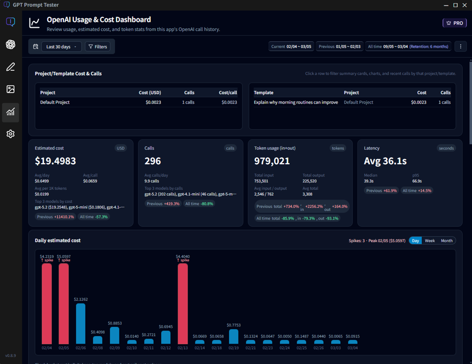
① Overview cards
Quickly check total estimated cost, total calls, total tokens, and average latency for the selected range. See details… -
② Daily estimated cost
A bar chart that reveals cost spikes on specific days instantly. See details… -
③ Model cost & tool share
Compare which models drive the most cost, and how much tools like web_search contribute. See details… -
④ Cumulative cost trend
See how cost accumulated over time and compare your current pace to the previous period. See details… -
⑤ Model latency trends
Track average response time by model over time, and compare normal calls vs web_search calls. See details… -
⑥ Hourly & weekday patterns
Identify peak usage windows and your overall usage rhythm. See details… -
⑦ Call list (raw logs)
Inspect the individual call logs that power every metric on this dashboard. See details…
💡Tip: The goal of this dashboard isn’t just “spending less”—it’s improving efficiency : getting the same (or better) quality for less cost and less time.
🔅Note: Project/template-level cost analysis is available in PRO.
PRO lets you attribute spend to specific projects/templates so you can see which experiments actually drive cost.
Date Range · The starting point for analysis
The Usage Dashboard recalculates everything—cost, tokens, calls, latency, and charts—based on the
selected date range.
That means the same underlying logs can look very different depending on the range you choose.
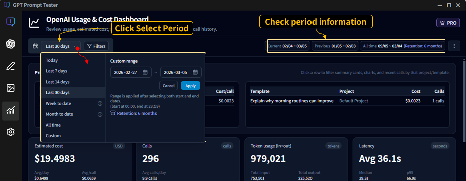
2-1. Range presets
Use the range button (top-left) to pick common presets or set a custom period.
- Today : Calls from 00:00 to now (today only)
- Last 7 days : The most recent 7 days including today
- Last 14 / 30 days : The most recent N days including today
- Week to date / Month to date : From the start of the week/month to today
- All time : All stored usage logs
- Custom : Choose start and end dates manually
2-2. What “Last 7 days” really means
“Last 7 days” means 7 days including today.
For example, if you select Last 7 days on Dec 15, the dashboard aggregates 12/09–12/15.
2-3. Previous period (comparison period)
The dashboard also shows a previous period automatically.
The previous period is the same length as your selected range and immediately precedes it.
- Current range: 11/16–12/15
- Previous range: 10/17–11/15
The dashboard uses these two ranges to compute period-over-period changes for key metrics.
💡Tip: For very short ranges (like Today), some trend sections may be hidden automatically, because the comparisons and cumulative charts are less meaningful.
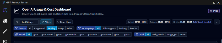
Top Filters · “What exactly are you looking at?”
The top filters define the scope for every number on this page—cost, tokens, latency, charts, and tables.
Beyond date range, you can filter by Feature (call source) / Writing step / Model / Tool,
so it’s important to confirm what’s currently selected before you interpret the data.
3-1. Date range (left)
- Select presets like Last 7/14/30 days or set a custom range.
- All metrics (cost/tokens/charts/tables) are recalculated based on the selected range.
- A matching previous period is computed for comparison.
3-2. Feature filter (call source)
The Feature filter is the fastest way to separate cost by where the calls came from. With Writing Studio added, the dashboard can now analyze both Playground usage and Writing Studio calls.
- All : All calls (Playground + Writing Studio + others)
- Playground : Only calls executed from the Prompt Playground
- Writing : Only calls executed from Writing Studio
- Image : Only calls generated by the Image Maker feature
- Others : Calls from other in-app utilities/features
3-3. Writing step filter (when “Writing” is selected)
If you select Writing, an additional step filter appears.
Writing flows often consist of multiple API calls, so breaking the data down by step helps you find
which step drives cost and latency.
- All : All Writing Studio calls
- Title suggestions : Calls for generating title ideas
- Draft writing : Calls for generating the main draft
3-4. Model filter
- Select All or a specific model (gpt-4, gpt-4o, gpt-5, etc.).
- When a model is selected, all metrics are computed using only that model’s calls.
- Writing Studio may use different models per step, so model filtering is great for narrowing down root causes.
3-5. Tool filter
- Filter by tool usage such as All / None (normal) / web_search.
- Selecting web_search is one of the fastest ways to isolate “search-driven cost/latency”.
- Tool filtering is often the quickest path to diagnosing sudden cost spikes.
3-6. Helpful filter combinations
- Writing + Draft writing + a specific model : See whether a particular model drives draft costs
- Playground + web_search : Isolate how search affects cost/latency in experiments
- All + a specific model : Decide whether a model is structurally inefficient over time
- Writing + Title suggestions : Check whether title generation is over-triggered
💡Tip: If the dashboard “looks wrong,” the first thing to check is the Feature filter.
If Writing Studio calls are included, total cost and call volume can look higher than expected.
How to read the Overview cards
The Overview cards compress the key results for the selected range into a few numbers.
The fastest workflow is: spot anomalies here (cost/calls/tokens/latency), then scroll down to the trend and breakdown charts to find the cause.
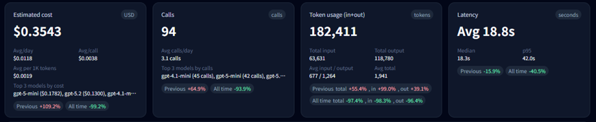
4-1. What the 4 cards mean
- Estimated cost (USD) : Your total cost for the selected range. This card also shows efficiency metrics like avg/day, avg/call, and avg per 1K tokens.
- Calls : Total number of executions in the range. You’ll also see avg calls/day and the top models contributing to usage.
- Tokens (in+out) : Total input + output tokens. The breakdown helps detect output inflation (too-long responses) via total and average input/output tokens.
- Performance (latency, seconds) : Average response time. Median and p95 help you detect “long tail” slow calls.
4-2. Reading the change (Δ) badges
The badges under each card show percent change compared to the previous period. A quick way to interpret them:
- 1) Check cost (USD) first
- 2) Check calls next
- 3) If calls are flat but cost increases : suspect longer outputs, tool usage (web_search), or a model change.
- 4) If latency increases : suspect tool usage, longer outputs, or model-specific slowdowns—then validate in the charts below.
💡Tip: “Cost ↑ + Calls ↑” usually means you simply ran more experiments. “Cost ↑ + Calls ↔” often means each call got more expensive (tools/output/model).
Daily trends · Cost / Calls / Tokens
Daily trend charts are the fastest way to answer: “What changed, and when?”
If you see a cost spike on a particular day, you can trace it down to the call list and identify the exact cause.
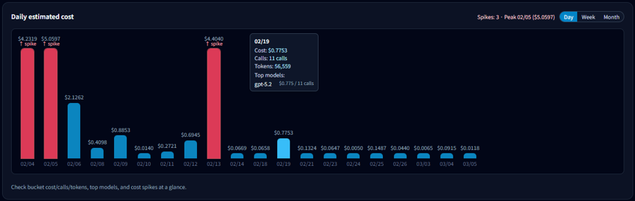
5-1. What to check first
- Which date spiked
- How big the spike is compared to typical days
- Whether the rise is gradual or a one-day event
5-2. Switching the bucket size (Day · Week · Month)
The chart is daily by default, but you can switch to weekly or monthly aggregation:
- Day : Best for pinpointing exact spike dates
- Week : Removes weekday noise to compare week-over-week
- Month : Best for long-term budget pacing
5-3. What you can see in tooltips
Hover a bar to view details for that date:
- Total cost for the date
- Calls (executions)
- Total tokens
- Top model contributing to the day’s cost
5-4. A quick spike diagnosis checklist
- If calls spiked : you likely ran more experiments that day.
- If calls are flat but cost spiked : suspect tools (web_search), longer outputs, or model changes.
- If one model dominates : verify in the model breakdown section.
💡Tip: After finding a spike date, scroll down to the Call list and inspect the prompts/models/tools used on that date.
Model & tool breakdown · Usage and cost
Your cost, speed, and output patterns can change dramatically depending on which models you use most.
This section is the most direct way to identify which models and tools are driving spend—and why (output length, tools, latency).
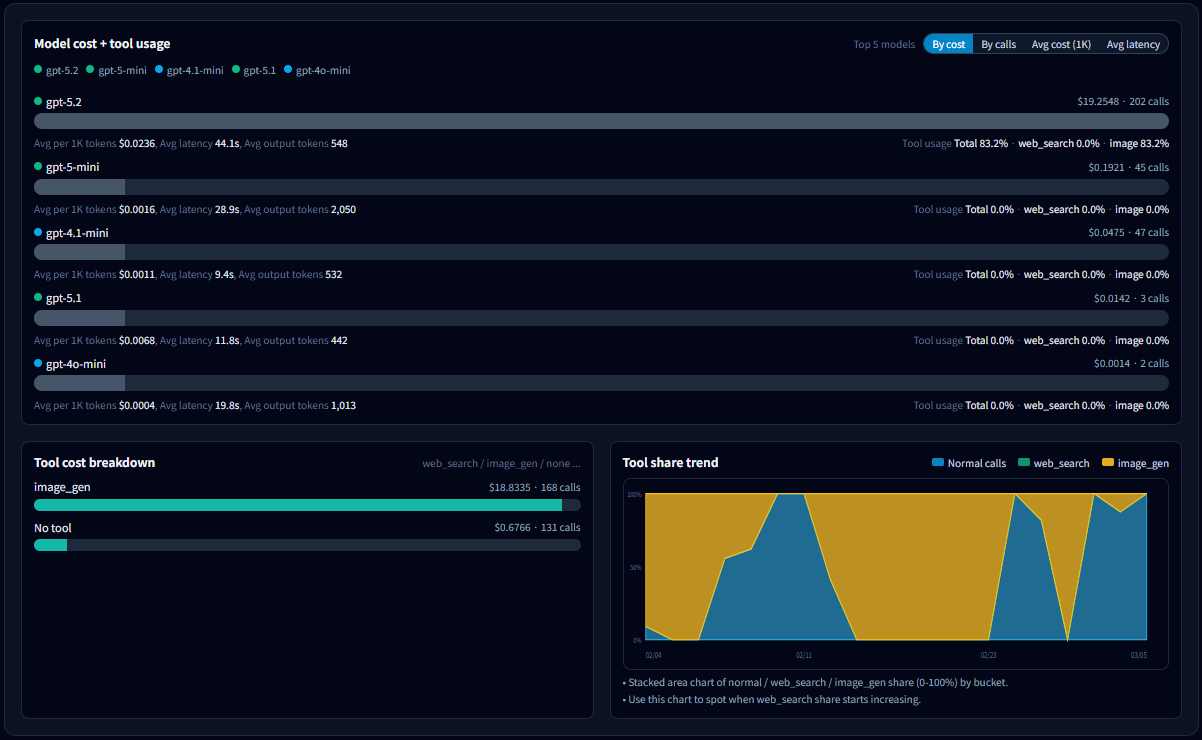
6-1. What to look for in the model list
- Total cost by model : Start with your top cost contributors.
- Calls : Distinguish “expensive because many calls” vs “expensive per call”.
- Avg cost per 1K tokens : Compare efficiency across models.
- Avg latency : Identify which model correlates with slowdowns.
- Avg output tokens : Detect models that tend to produce longer outputs (often a cost driver).
- Tool usage rate : Separate “model price” vs “tool overhead (cost/latency)”.
6-2. Why sorting matters
Change the sort key to reveal different kinds of problems:
- Sort by cost : Find which models drive total spend.
- Sort by calls : Find overused models.
- Sort by avg cost per 1K tokens : Find structurally expensive models.
- Sort by latency : Find models that most affect responsiveness.
💡Tip: Try sorting in this order: Cost → Calls → Avg cost/1K tokens. It quickly separates “usage volume” from “per-call cost” and “structural inefficiency.”
6-3. How to read the tool cost breakdown
- Costs are split by tool usage such as normal / web_search / image_generation.
- If cost increased while calls stayed similar, a rising web_search share is a common cause.
- If most cost is in normal, the likely cause is model choice or output length.
6-4. Tool share trends: “When did it change?”
- Shows how the share of normal / web_search / image_generation changes over time (bucketed by day/week/month).
- If the web_search area grows from a certain point, jump to that date in Daily trends and the Call list to confirm the cause.
6-5. Common ways to reduce cost
- Outputs got longer : Add stricter length/format constraints, or adjust max output tokens.
- Use models by role : Run lightweight models for routine work, and reserve premium models for critical tasks.
- Don’t keep tools on by default : Enable web_search / reasoning only when the call truly needs it.
💡Tip: This section helps you narrow down suspects quickly. Once you identify a model/tool/time window, validate with Daily trends and the Call list.
Cumulative cost trend · How to interpret it
The cumulative chart shows cost over time by continuously adding it up across the selected period.
A steeper slope means you’re spending faster at that point in time—and it helps you estimate where you’ll land by the end of the period.
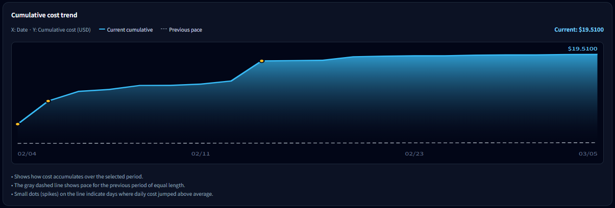
7-1. Solid line vs dotted pace line
- Solid line (current) : Actual cumulative cost for the selected period.
- Dotted line (previous pace) : A reference line assuming you spend at the same pace as the previous period.
- If the solid line is above the dotted line: you’re spending faster than last period.
- If it’s below : your pace is more stable than last period.
7-2. When this chart is most useful
- Monitoring weekly/monthly budget pacing
- Measuring how spikes affect your overall spend
- Estimating whether you may exceed your target before the period ends
🔅Note: If the range is Today, this chart may be hidden because the trend is not meaningful. It’s most useful when the selected range spans 2+ days.
💡Tip: This chart is less about “how much you spent” and more about “whether your current pace is risky.”
Latency analysis · Finding why things got slower
Latency is the most noticeable performance signal for users.
In most cases, “sudden slowdowns” can be explained by one of these four factors:
- Model : higher share of premium models
- Tools : using Web Search / Reasoning
- Output length : longer outputs (more tokens)
- Environment : temporary network or provider-side latency
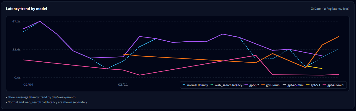
8-1. How to read the model latency trend
- Each line represents the average latency trend for a model (bucketed by day/week/month).
- If only one model spikes, that model’s usage conditions likely changed (tools/output), or its share increased.
- When shown separately, compare normal latency vs web_search latency to confirm tool impact.
8-2. Why you should read cost and latency together
- Latency ↑, cost ↔ : often network/environment-related.
- Latency ↑, cost ↑ : often more tools (web_search/reasoning) and/or longer outputs.
- Use the model breakdown and daily trends to confirm the exact cause.
💡Tip: When you feel “it’s slower,” first identify when it changed on this chart, then drill down into that time window in model/tool breakdown and the Call list.
Usage patterns · By hour and by weekday
This section shows when you use GPT the most.
It’s less about cost and more about understanding your work rhythm and usage patterns.
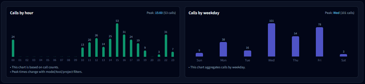
9-1. Calls by hour
- Shows which hours of the day concentrate the most calls.
- If usage peaks during work hours, it often indicates a workflow or production pattern.
- If late-night usage is high, it may indicate batch work, automation, or personal experiments.
9-2. Calls by weekday
- Aggregates calls by weekday for the selected range.
- Weekday-heavy usage often maps to work/project usage; weekend-heavy usage often maps to personal or content tasks.
- If one weekday is unusually high, check if a recurring routine (weekly report, batch job) exists.
9-3. How to use these insights
- If calls concentrate in a specific time window, optimizing model/tool settings there can improve perceived performance.
- If calls appear at unexpected hours, verify automation or repeated jobs are behaving as intended.
- If weekday variance is large, jump to Daily trends and the Call list to validate what happened.
💡Tip: This section helps answer “how you use it,” not “why it got expensive.” Combined with cost/latency analysis, it can reveal optimization opportunities tied to your workflow.
Call List · The raw data behind every API request
This section shows the individual API call records that power
all metrics displayed in the Usage Dashboard.
You can review when each call happened, which feature triggered it,
which model was used, and how many tokens and cost were generated.
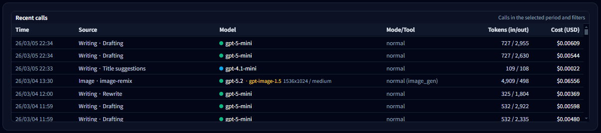
10-1. What you can see in the Call List
- Time — The exact moment the API call occurred
- Feature — Which app feature triggered the call (Playground, Writing, Image Maker, etc.)
- Model — The OpenAI model used (for example gpt-5-mini, gpt-4.1-mini)
- Mode / Tool — Execution mode such as normal run, web search, or image generation
- Tokens (in / out) — Input and output token usage
- Cost — The estimated OpenAI API cost for that call
10-2. How to use the Call List
- If a request seems unusually expensive, you can quickly identify which feature and model caused it.
- If your total call count is higher than expected, check for automation loops or repeated experiments.
- When a graph in the Usage Dashboard shows an unusual spike, use the Call List to inspect the exact requests behind it.
💡 Tip: Dashboard charts summarize usage trends, but the
Call List shows the raw source data behind them.
When analyzing costs or troubleshooting usage patterns,
this is usually the best place to start.
Pro-only data management · Advanced analysis
As your experiments scale and you work more with projects/templates, PRO expands both
analysis scope and data management.
All features in this section are available only with a PRO license.
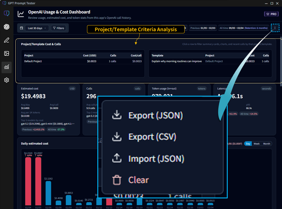
11-1. Project/template-based analysis
- Use Project/Template filters to attribute cost and calls to specific assets.
- This is one of the most powerful ways to find “where cost is leaking” when you run many experiments.
- Especially useful for teams and long-running projects where cost ownership matters.
11-2. Export / Import
- You can export usage data as JSON or CSV files to create backups or transfer the data to another PC.
- Useful for device changes, reinstalls, and long-term tracking.
- Import restores your previously saved usage history.
⚠️Note: Import may merge with existing data or reset then restore, depending on your selection. Please read the on-screen prompts carefully.
💡PRO is less about “adding features” and more about scaling safely when your usage grows.
A natural path is to learn the workflow on Free, then move to PRO when you need stronger organization and attribution.
See full PRO comparisons on the Pricing page.
FAQ (cost / quota / display differences)
Q1. Does it match the cost shown on OpenAI exactly?
The app calculates and displays metrics based on your call logs.
Due to differences in time zones, aggregation methods, and reporting delays,
small discrepancies may occur compared to OpenAI’s official dashboard.
Q2. I think some calls are missing from the dashboard.
If the app crashed or a network error occurred, some calls may not have been saved.
If you can reproduce it, please email the timestamp/model/context to
boxkeeper@easymbox.com to help us investigate.
Q3. Where should I start if I want to reduce cost?
A practical order is: (1) model cost breakdown, (2) tool usage share, (3) output tokens (long responses). This sequence usually reveals the root cause fastest.
For a smoother maintenance workflow, these docs are a great next step: